 Shafeen Alam
Playground
Things I make because I am curious.
Products I ship on my own, AI interactions I prototype to understand them, machines I take apart, and drawings I have been making since long before I designed software. None of it is client work. All of it is where the habits come from.
I hold a BFA in Illustration and Animation from San Jose State University and worked as an illustrator and concept artist before I designed software. Thumbnails before rendering. Silhouettes before detail. The same subject three times under three different constraints, because the constraint tells you which parts actually matter. Every one of those is something I still do, just with interfaces now instead of paint.
Products
Things I designed and built myself, running in the world rather than described in a deck.
Stream Find
Streaming availability ranked by what you already pay for. Included options first, then free, rental, and purchase in one vocabulary. Designed and coded by me, with AI assistance throughout the build.
What comes next
The next product will most likely sit in mobility. Vehicle health explanation, charging reliability, or the service and repair loop. When it exists as something you can use, it will show up here first.
AI experiments
Working interactions I build to understand how these systems should behave, especially at the edges where they are wrong, slow, or unsure.
The Interpres AI interaction
A working recreation of the assistant I designed: structured reasoning, evidence links, confidence, the branch where it refuses to answer, and the confirmation every sensitive action passes through. Play it through both branches.
AI-assisted design practice
Claude and Claude Code, Cursor, ChatGPT, and Figma Make, used to prototype workflow logic and pressure-test edge cases rather than to generate screens. Stream Find is the largest thing this practice has produced so far.
Mobility & Machines
Cars are the most demanding consumer system I interact with: connected hardware, software, diagnostics, safety states, and a service experience most owners never fully understand. I am interested in the same things here that I am interested in at work, which is how a complex machine explains itself to the person responsible for it.
Systems thinking beyond software
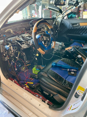
The same mindset I bring to product, applied to vehicle integration. I retrofitted driver-assistance hardware into a car that was never built to take it, which meant working inside someone else's architecture and proving each signal before trusting it.
Retrofit
Heads-Up Display plus Adaptive Cruise Control and Pre-Crash components, pulled into a 2013 Lexus GS450h that never shipped with them.
Constraints
Everything had to work inside the existing CAN bus wiring. No clean slate, no spare bandwidth, and no documentation written for this.
Dependencies
Sensor dependencies and control module integration, mapped before anything was spliced.
Validation
Signal paths verified before system activation, because a driver-assistance feature that activates on a bad signal is worse than one that never activates.
Automation must be grounded, validated, and controlled before it earns trust.
Which is the same argument I made for an AI assistant in a security operations center, a few years and one industry away. It is why autonomy validation resonates with me.
Explainable diagnostics
A warning light is a notification, not an explanation. What would it take for a vehicle to state severity, confidence, and consequence in terms an owner can act on.
Serviceability
What the vehicle, the app, and the service center each know, and where the handoffs between them drop information the owner needed.
Human machine interaction
Controls, feedback, and failure states, judged the way I would judge any operational interface: can you tell what is happening, and what to do next.
Garage notes
A running visual journal of what I maintain, modify, and investigate, plus interface critiques from the driver's seat. My build thread lives on Instagram, and the written entries land here. Every entry answers the same five questions, which is the same structure I use for a product critique.
- What did I notice?
- Why did it matter?
- What did I investigate?
- What did I change or learn?
- How could the experience be improved?
Art
Illustration and concept work, mostly predating my product career. Grouped by what each series was teaching me.
Architectural studies
Graphite, drawn from observation. Slow, and useful for exactly that reason.
Still life under constraint
The same setup painted three times, each under a different palette restriction, with progress states kept alongside. This is the series I think about most in product work. The constraint is not a limitation to work around, it is what forces a decision about what actually matters in the image.
Observational drawing
Animals from life. No composition to hide behind, no rendering to fall back on. Just whether the structure underneath is right, drawn enough times that the shapes become known rather than copied.
Character development
Three characters from Browning's My Last Duchess and two from Bradbury's The Veldt. Each sheet works the same way: silhouettes first to test whether the character reads at a glance, then structure, then one rendered pass. The silhouette row is the real work. If the shape does not read in black, no amount of rendering saves it.
Environment concepts
Environments for A Day in the Life of Beethoven. Every sheet runs the same sequence: ten thumbnails to find the composition, four color keys to find the mood, then one resolved painting. Cheap exploration first, expensive rendering last, and only after the decision is already made.
Where it meets the product work
One artifact that belongs to both practices.
Publications
Where this work has been published.
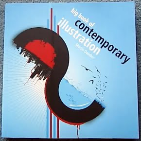
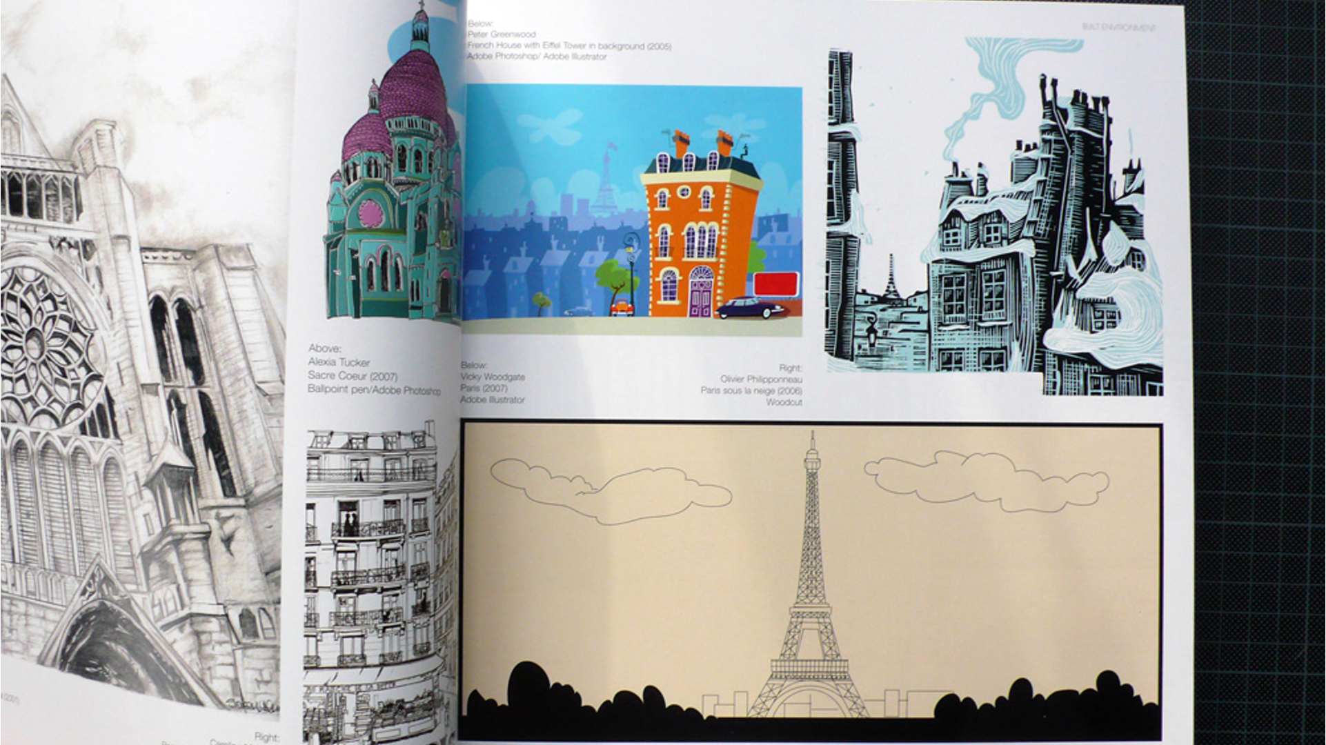
The Big Book of Contemporary Illustration
Martin Dawber. My cow and architectural studies appear in this collection.
2009 Vans’ Warped Tour: Guide to Not Being a Complete Environmental Disaster
A full color mini magazine. My cow study appears in it, alongside original artwork by Matthew Gray Gubler, with contributions from tour creator Kevin Lyman, Matt Wachter, Philippe Cousteau, Robert Kennedy Jr.’s Waterkeeper Alliance, David Pirano, Alex Hallatt and Joshua Katcher, aka The Discerning Brute. It is packed with tips on green living, plus anecdotes on touring and living green from Warped Tour bands, past and present.

Extreme Metaphors: A Launchpad for Other Explorations
Simon Sellars. My illustration for J.G. Ballard's short story "The Drowned Giant" appears in his introduction to Extreme Metaphors: Interviews with J.G. Ballard 1967 to 2008, as published on his site.
Read the article →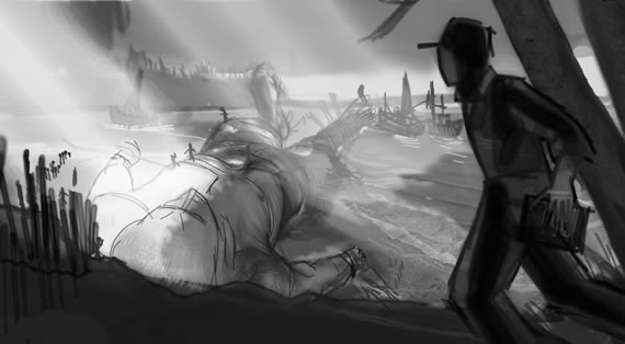
Interview exercises
Design assessments I was asked to complete as part of hiring processes. Short briefs, tight time, and no access to the people who built the product.
eBay Motors search
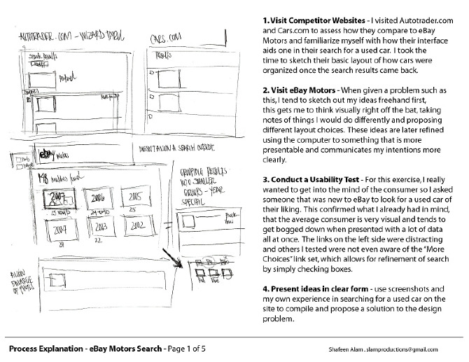
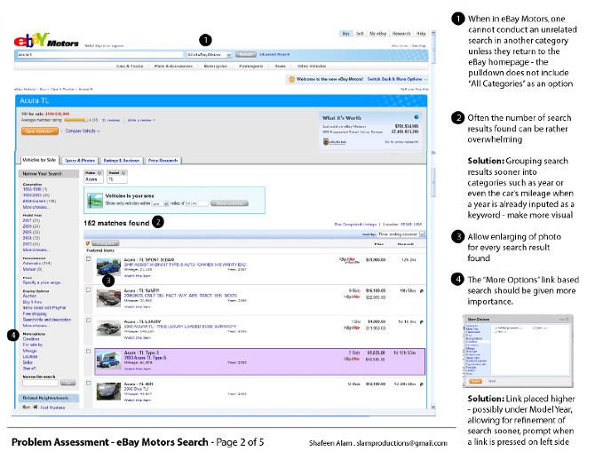
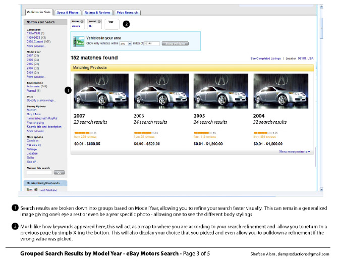
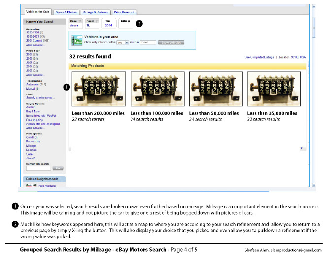
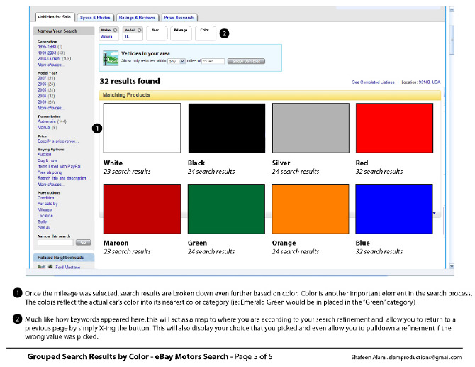
The brief: improve how people search for a used car on eBay Motors. I reviewed Autotrader and Cars.com, sketched ideas freehand, and tested the current site with someone new to eBay. They were overwhelmed by the number of results and missed the "More Choices" refinements. My answer was to group results into visual steps, first by model year, then mileage, then color, with each choice kept as a removable keyword above the results.
Crooze reservation management
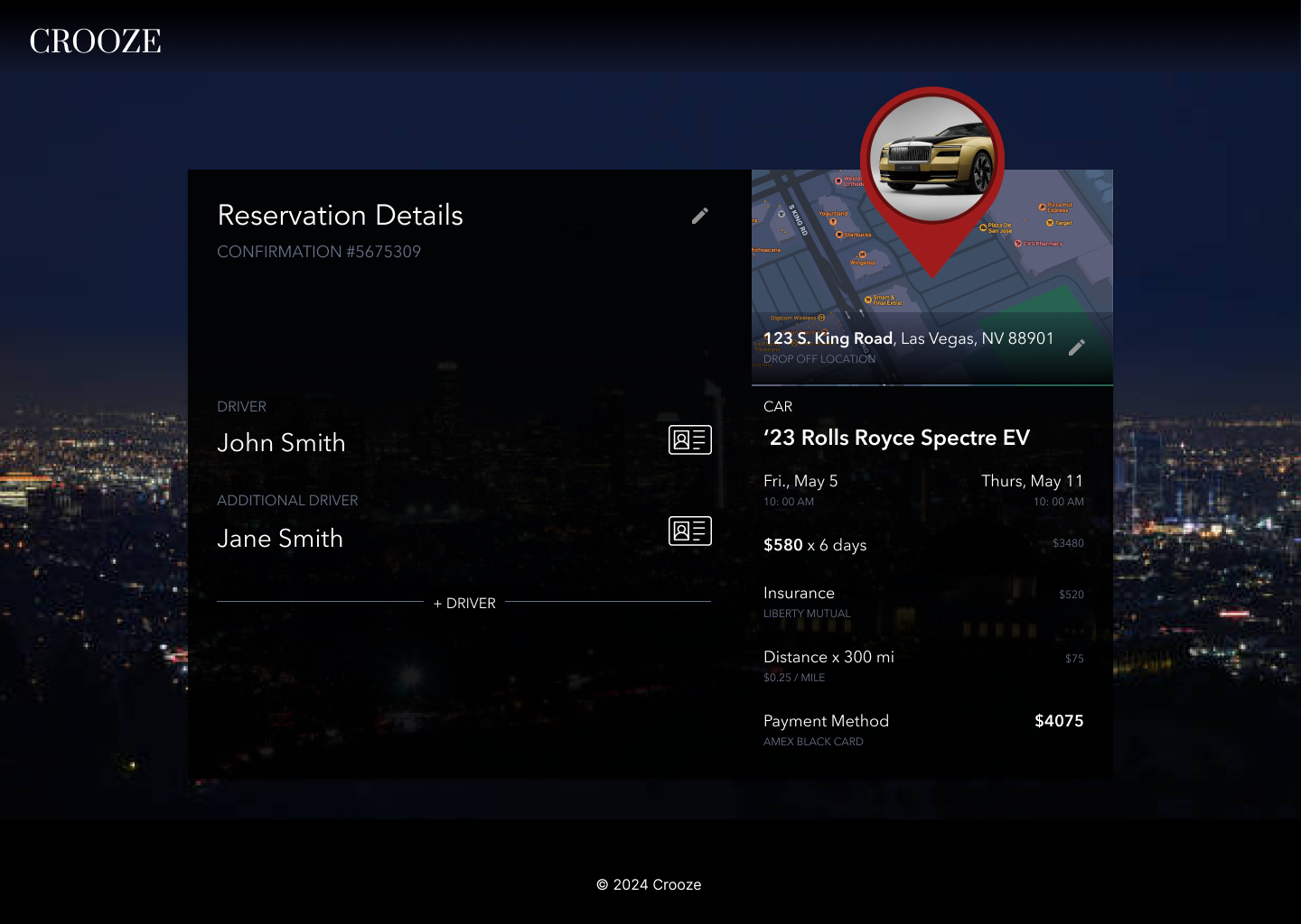
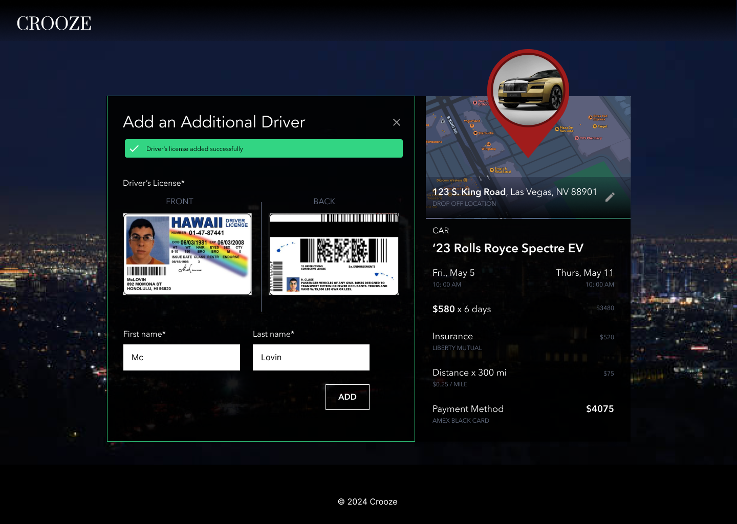
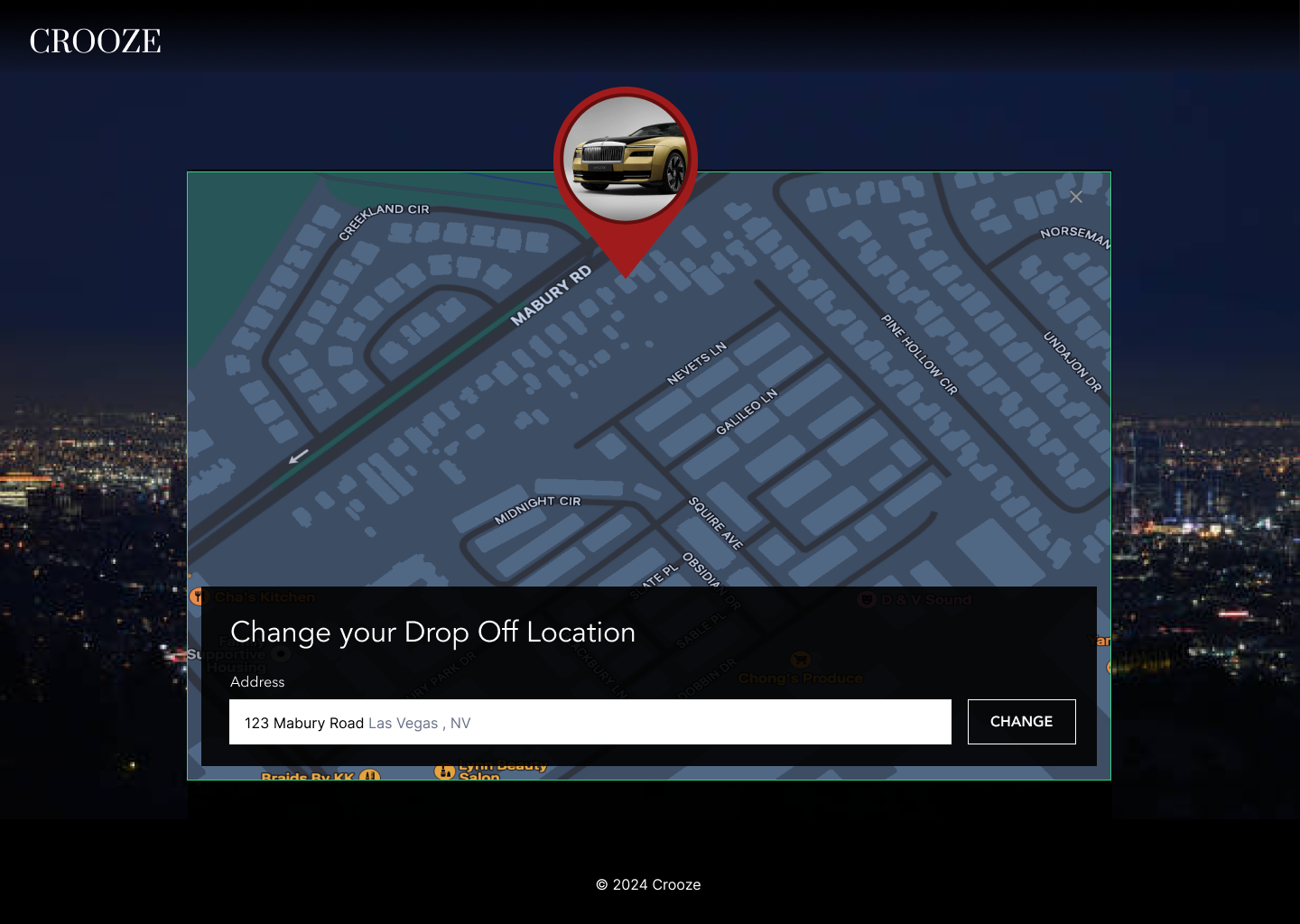
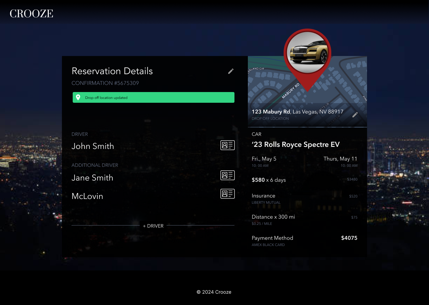
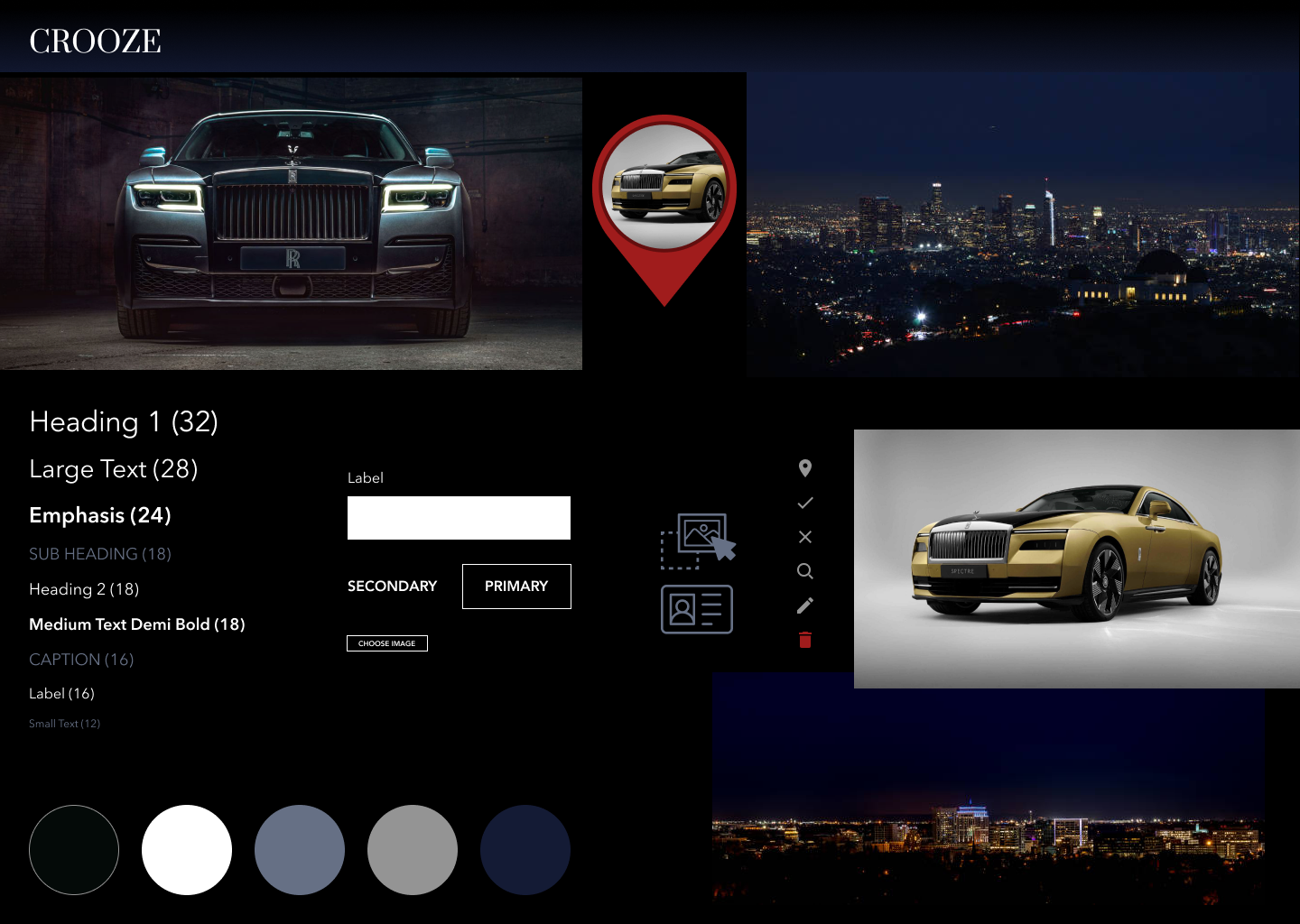
The brief: help customers of Crooze, a fictional luxury car rental service, update their reservations after booking. I designed flows for adding and removing drivers, uploading driver's licenses, and changing delivery locations. The concept brings reservation details, map-based address selection, and clear update confirmations into a consistent visual language.
Edits open as in-line modals over the reservation. Adding a driver takes a license upload and a name, and removing one can be undone from the toast. The drop off map updates as the user types an address.
Vulnerability findings, prioritized by AI
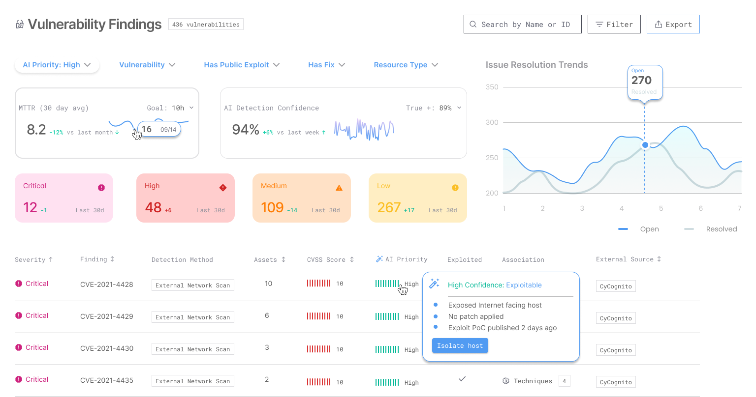
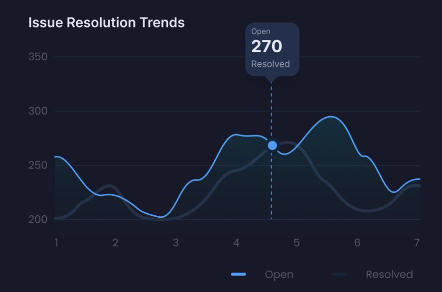
The brief: redesign a findings table so a security responder can quickly identify, prioritize and track vulnerabilities, and show how issues get resolved over time. With 436 findings and many false positives, responders don't know where to start. I put an AI priority score on every row, with a hover that explains why, and added a summary header with severity counts, MTTR and AI detection confidence. An open versus resolved trend line shows velocity and bottlenecks.
Unfinished ideas
Concepts I have not resolved, kept visible because pretending a portfolio is only finished work is its own kind of dishonesty.
EV service experience
A self-initiated case study I have scoped but not built: a vehicle detects a fault, explains its severity and its confidence, and the owner is carried through triage, scheduling, and repair visibility without losing the thread.
Concept · self-initiatedCharging reliability
Availability is the number every app shows. Reliability is the number drivers actually need, and nobody surfaces it well. Early sketches only.
SketchDesign systems for AI states
A component set for the states most systems leave undesigned: uncertain, degraded, refused, partially grounded. Pulled from Interpres, not yet generalized.
In progressCheap exploration first. Expensive rendering last. Never the other way around.