Shafeen Alam
← All work
Interpres Security/Threat & exposure intelligence platform/Cybersecurity

Continuous threat exposure management, made legible enough to act on

Interpres curated finished intelligence from more than 50 sources, aligned it to MITRE ATT&CK, NIST, ISO, and CIS, and prioritized controls and remediation. As the sole designer, I spent week one auditing it, then spent the following months fixing the four layers underneath: navigation, accessible color, consistency, and a design system that could take new modules without breaking.
Role
Sole Principal UI/UX Designer
Partners
CTO, Head of Product, 5 engineers
Stage
Pre-seed, about 15 people
Constraints
Two-week sprints, licensed charting library
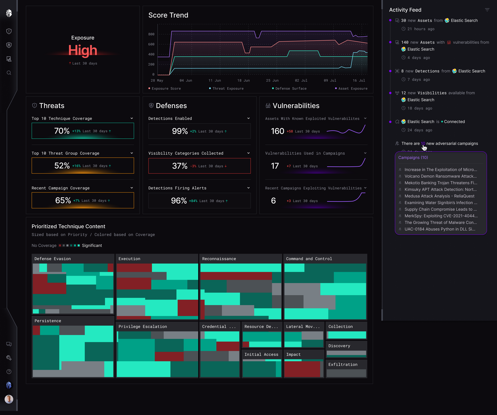
Interpres dashboard showing exposure score High, a score trend chart, Threats, Defenses and Vulnerabilities panels, a prioritized technique content treemap and an activity feed
The dashboard users landed on. Exposure score and trend up top, threats, defenses and vulnerabilities as separate reads, and the prioritized technique treemap sized by priority and colored by coverage. Everything below is about making this much information legible rather than merely present.

60-second read

Problem

A CTEM platform curating finished intel from 50 or more sources, with navigation, color, and component patterns that had grown faster than anyone could keep consistent.

System decision

Fix the four systemic layers rather than individual screens: information architecture, accessible color, component consistency, and a design system that could absorb new modules.

My contribution

Sole designer. Audited the product in week one, shipped the first win in five days, then drove the migration to Tailwind and MUI with the front-end engineer.

Impact

Report generation up 42%. Contrast brought to AA and AAA. Repeat use settled at four to five times a month.

01 · Shipped

A redesigned reporting flow, an accessible color system, a consolidated information architecture, and a component library migrated onto Tailwind and MUI with the front-end engineer.

42%
increase in reports generated
4 to 5
repeat uses per month, clustered at month end
AA / AAA
contrast across every status color

02 · Week one

I audited the whole experience with fresh eyes before proposing anything. Screenshots marked up with everything that struck me as odd: interactions, missing patterns, inconsistencies, plain questions. Then I presented it to stakeholders as a loose plan of action rather than a finished verdict.

I also scheduled recorded product walkthroughs with people across the company and stayed hands-off, letting each person run it as they saw fit. What someone shows you first, and what they skip, tells you more about the real information architecture than any sitemap. One of those happened over coffee with a front-end engineer who lived nearby. I took handwritten notes to avoid interrupting the flow, with a column for each person's opportunities and challenges.

Four areas the audit surfaced

01 Navigation Inconsistent menus and icons across modules, so finding a known thing meant relearning where it lived.
02 Color and accessibility Status colors that red/green colorblind users could not separate. Customers had started raising ADA compliance directly.
03 Consistency The same interaction expressed differently in different places, with no shared component vocabulary.
04 Scalability Patterns that broke as soon as a new module arrived, including brittle dividers holding layouts together.

I also set up a local environment so I could pull builds and see my designs running. That gave me Storybook, where the components actually lived, and the ability to QA in code rather than in a static file.

03 · The first win

On my first day the CTO handed me the Export Report screen, a high-touch feature shipped just before I joined. A user generated a report of their current security landscape and hit OK. It asked for too many decisions upfront and pushed the key context below the fold.

This flow was the report card. It was how customers saw whether we were worth the investment, and how they identified problem areas in their own posture. Getting it right early also bought me the credibility to argue for the bigger structural work.

User story

As a user, I want to generate a personalized report of my current security posture, so I can prioritize threats and find the flaws in my ongoing controls.

One week, start to delivery

Monday Discovery Tuesday Iteration and framing Wednesday Wireframe Thursday Refinement Friday Delivered

What I could and could not change

The brief I was given was plain: it works well as is, just style it better. Here is what I pushed on and where I landed.

Shipped Docked calls to action Not a component we had, and treated internally as nice to have. I built it anyway because the primary action was scrolling out of view.
Shipped Indeterminate checkbox behavior Approved on the condition that I documented exactly how it behaves in every partial-selection scenario. Fair condition, so I wrote it out.
Cut Show what you selected last time Read as repeat behavior rather than a feature. I wanted it as a control for measuring what changed over time, and lost that one.
Deferred Behavior inherited from a framework The real lesson. Rather than argue each behavior individually, invest in a framework that brings them by default, plus analytics to come back with evidence.

The approach

  • Sensible defaults in the export dialog, with progressive disclosure, so the critical context stayed above the fold and the click count dropped.
  • Users could expand only the areas relevant to them, drilling into the specifics behind each section.
  • Changed the primary button from a download icon plus the word Report to Generate a Report, so the action named itself.
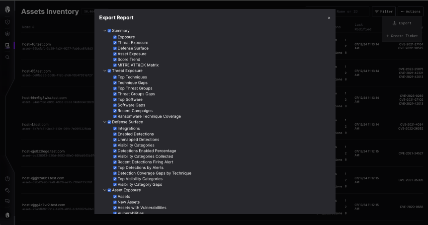
Original Export Report dialog with every section and sub-option expanded and pre-checked, filling the screen with nested checkboxes
Before. Every section and every child expanded and pre-checked on open: Summary, Threat Exposure, Defense Surface, Asset Exposure, each with a dozen sub-options. You had to read the whole tree to decide anything, and the action sat below the fold.
Redesigned Generate a Report dialog with five collapsed sections, each with a one-line description, plus Select all, Clear and Download
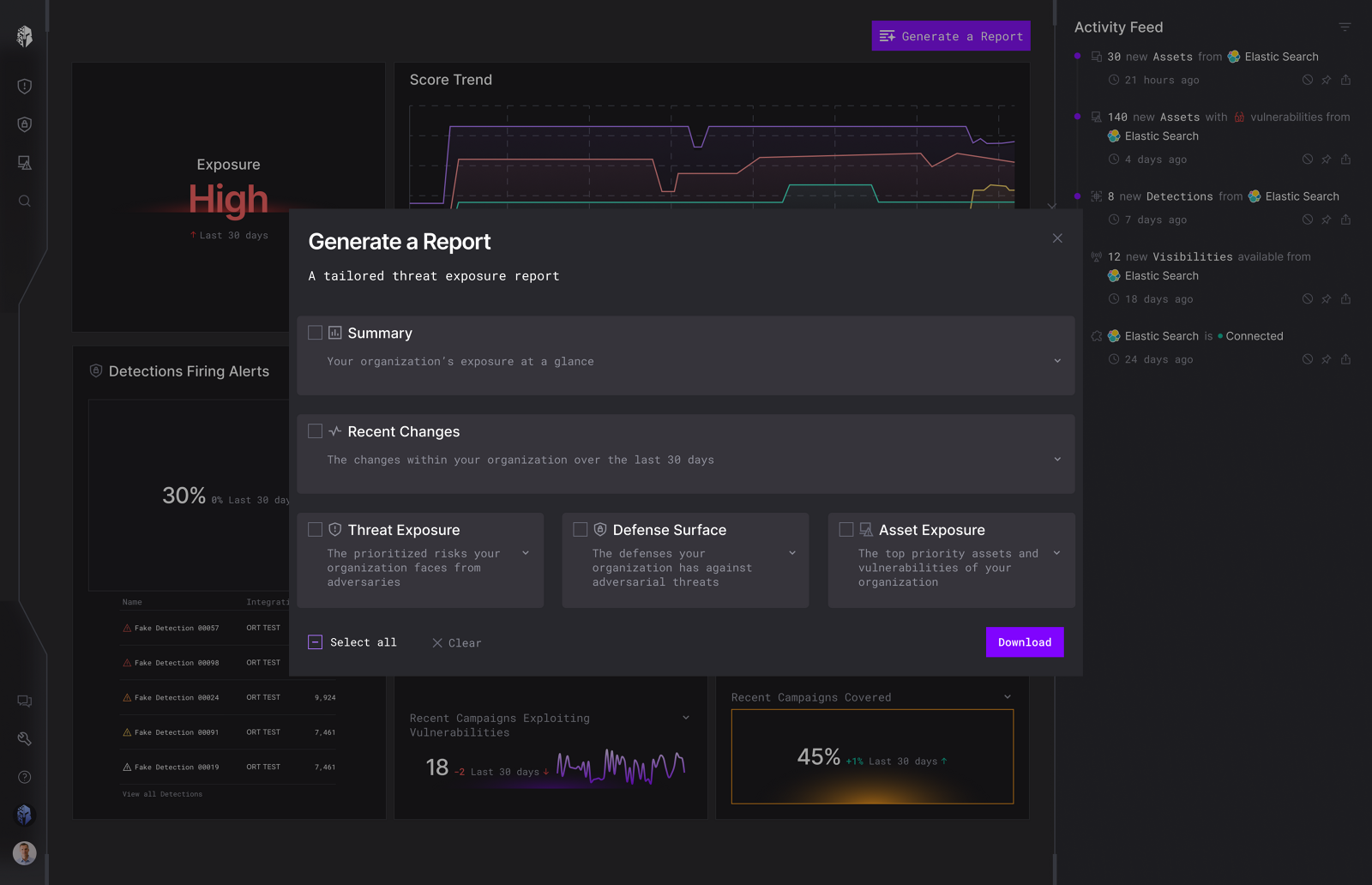
After, at rest. Five named sections, each with a line saying what it contains, collapsed by default. Select all and Clear made explicit, Download always in view. The dashboard trigger also changed from a download icon plus the word Report to Generate a Report.
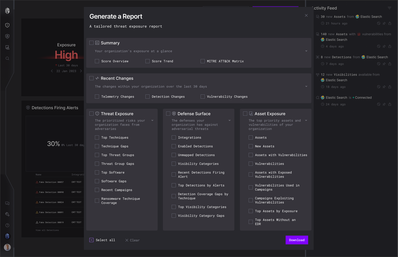
The same dialog expanded to reveal sub-options under Summary, Recent Changes, Threat Exposure, Defense Surface and Asset Exposure
After, expanded. The full depth is still available, it just arrives on request. This is the behavior the heat map later confirmed: people opened at least two sections per report rather than accepting everything.

04 · Color and access

Customers had begun complaining that we did not meet ADA standards. The specific failure was concrete: users with red/green colorblindness could not tell our statuses apart. In a security product, that means the severity of a finding is invisible to some of the people responsible for acting on it.

I established a standardized set of primary, secondary, and accent colors meeting AA and AAA contrast ratios, and simplified the coverage scale so the ranking survived without relying on hue alone.

MITRE ATT&CK matrix with the current coverage legend beside measured contrast ratios of 6.21, 2.86, 4.88, 2.47 and 2.01
The audit. Coverage ran Full to Poor across five colors and only two cleared AA. Strong measured 2.86, Poor measured 2.01, which is why the ranking was unreadable for some users.
The same matrix with a revised palette measuring AAA 12.67, AAA 7.79, AAA 6.3, AA 3.73 and AA 4.24, above nine colorblindness simulations
The revision. Three steps at AAA, the remaining two at AA, and the legend re-tested against nine forms of color vision instead of checked once against normal vision.
Coverage legend simplified to Full, Moderate and Poor, rendered under achromatopsia, tritanopia, deuteranopia and protanopia simulations, with a popover defining Full coverage
The scale itself was the deeper fix. Five steps could not stay distinguishable under protanopia or deuteranopia no matter which hues I chose, so I simplified coverage to Full, Moderate, Poor and added an inline definition of what Full actually means.
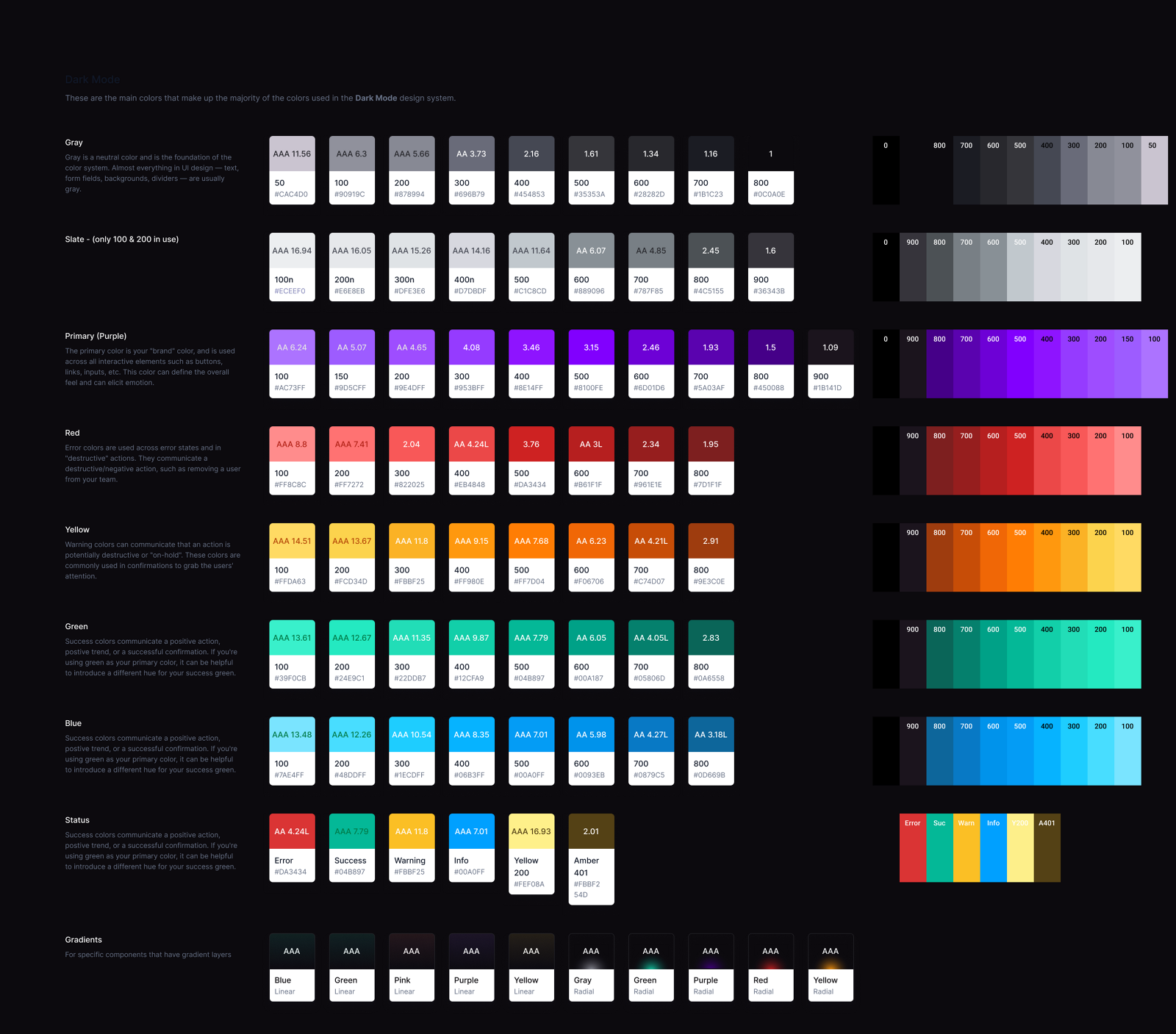
Dark mode color system documenting gray, slate, purple, red, yellow, green, blue and status ramps with a measured contrast ratio printed on every swatch
The system it produced. Every swatch carries its measured ratio, so the next person picking a color does not have to redo the audit. Status colors are documented separately from the brand ramp, because they carry meaning rather than style.

05 · Navigation and IA

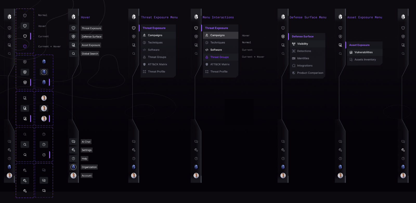
Menus and icons differed across modules, so users relearned the layout each time they moved between them. I consolidated the information architecture, added proper hover and active states, and removed the brittle dividers that were holding layouts together, so the structure could take new modules without being rebuilt.
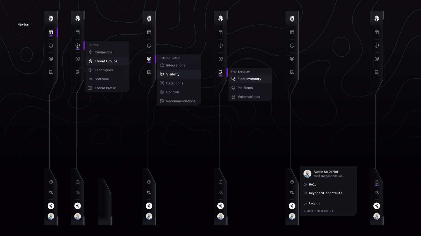
Earlier navigation rail with Threats, Defense Surface and Fleet Exposure menus opening flyout lists, plus an account popover
The structure I inherited. Top-level groups were Threats, Defense Surface and Fleet Exposure, with flyouts that overlapped in content and icons that did not consistently signal which group they belonged to.
Consolidated navigation documented across seven frames showing normal, hover, current and current-plus-hover states for every rail item and each menu
The consolidated version, documented as a state matrix rather than one happy-path screen. Groups became Threat Exposure, Defense Surface and Asset Exposure, and every rail item has normal, hover, current and current-plus-hover defined, so your location is never ambiguous.
Navigation frames overlaid with magenta measurement bars and horizontal alignment guides comparing the built spacing against the design
Design QA against the build. Measuring the implementation is how consistency work survives contact with a codebase instead of drifting one commit at a time.

06 · Design system

A toolkit of reusable components and style guides, so consistency held as the product grew instead of decaying with each new screen. Buttons, input fields, and cards, each with enabled, hover, focused, disabled, and error states defined rather than improvised.

Working with the front-end engineer, we branched the code and migrated from the licensed third-party stack to Tailwind CSS and MUI. We took modal dialogs first, deliberately: they involve the most components, so they proved the value of the migration fastest. Everything was QA'd in Storybook and in live builds.

This is also where the export-flow lesson paid off. Behaviors I could not win by argument arrived for free once the component library brought them by default.

MUI toggle button, checkbox and button components documented across enabled, hovered, focused and disabled states, including the indeterminate checkbox
Buttons, toggles and checkboxes with enabled, hovered, focused and disabled defined for each. The indeterminate checkbox sits in the middle group: the behavior I had to write out scenario by scenario to get approved, now arriving as a documented default.
MUI text fields in enabled, hover, focused, disabled and error states, plus multi-line variants at four, six and eight rows in filled and outlined styles
Text fields across every state including error, plus multi-line variants at fixed row counts in both filled and outlined styles. Unglamorous, and the reason two people could not ship two different error treatments.
Storybook sidebar listing Chip, EmptyState, Loader, StatusIndicator and MUI components, with a Base Select Multi Select rendered live
The same components in Storybook, where the engineer and I compared intent against the build. This is where handoff stopped being a document.
Icon library sheet showing the full set, the Material and MUI subset, one-off icons and product logos
The icon set, split into the full library, the MUI subset, one-offs and vendor logos, so the navigation work had a consistent vocabulary to draw from.

07 · Ongoing work

Three continuing threads, each about closing the distance between seeing something and doing something about it.

Integration recommendations

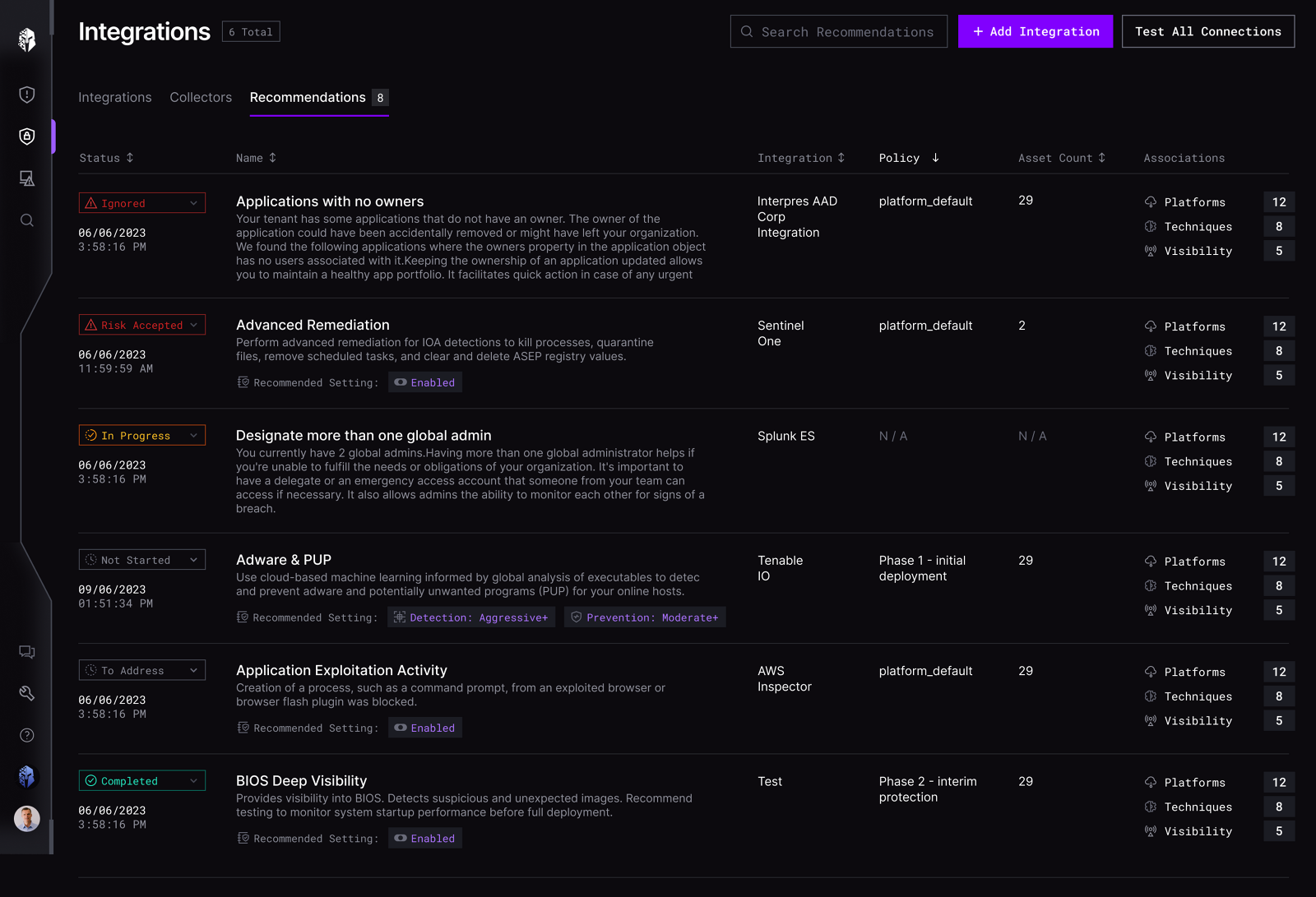
Introduced an actionable chip interaction so a recommendation could be remediated in place, rather than read in one screen and actioned in another.

Technique flow page

Every node opened a new context with no way back, so you lost the parent you started from. Added breadcrumbs and a standardized layout to preserve context.

Integrated AI assistant

Product-wide in-context education. Tooltips and popups that explain security posture and the next action, at the moment the question comes up.
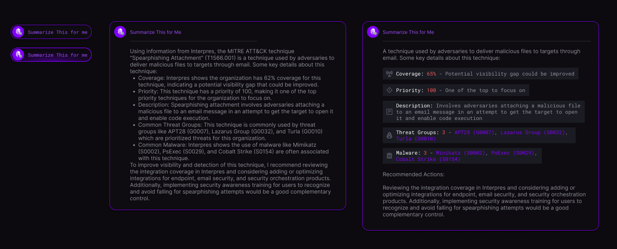
Three versions of a Summarize This for Me response: a collapsed trigger, a long prose paragraph, and a structured version with labelled coverage, priority, description, threat group and malware rows
The assistant, before and after. The middle version is correct and unreadable: eleven lines of prose nobody scans under time pressure. The right one carries the same content as labelled rows, so coverage at 65%, priority at 100 and the associated threat groups are each findable at a glance. Recommended actions stayed prose, because that part genuinely is a paragraph.
Integration recommendations table where each row carries a status dropdown reading Ignored, Risk Accepted, In Progress, Not Started, To Address or Completed
Actionable chips on the recommendations list. Status is a control rather than a label, so an analyst can accept a risk or mark something in progress from the list itself, instead of navigating away to record a decision they have already made.
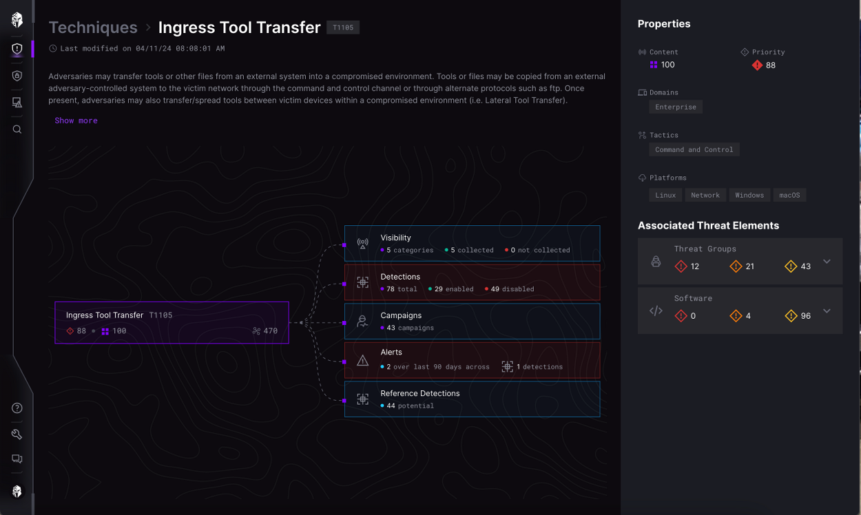
Technique detail for Ingress Tool Transfer with a breadcrumb, the technique node linked outward to visibility, detections, campaigns, alerts and reference detections, and an associated threat elements panel
Technique flow with a breadcrumb and a standardized layout. The parent technique stays anchored on the left with its relationships fanning out from it, so following a thread no longer costs you the context you started from.

08 · Measured

We instrumented the reporting flow with OneStory to see whether the redesign held up over time, rather than trusting the launch spike.

Reports generated up 42%
Sections opened per report at least 2
Repeat use 4 to 5 per month
Primary screen size 1920 × 1080

The heat map answered the question the trade-off debate could not. Users opened at least two different sections per report, which is exactly the drill-in behavior progressive disclosure was meant to enable.

09 · Takeaways

01 Ship a small, visible win first. Trust buys you the bigger argument later.
02 When you cannot win a behavior on its merits, win it by choosing a framework that brings it for free.
03 Instrument before you argue. Analytics turn a taste debate into a factual one.
04 In security tooling, color is not decoration. If a colorblind analyst cannot read a status, the status does not exist.
05 Run the product walkthrough, do not lead it. What someone chooses to show you first is the real information architecture.

A finding nobody can read is not intelligence. It is noise with a severity label.

Interpres Security was acquired by CyberProof in late November 2024, and my position was eliminated in the transition.
The AI assistant case study → Back to all work